SendQ is a SaaS platform by Lumus AI, based in Florida, focused on SMS marketing. It enables companies to manage subscribers, create campaigns, and send messages at scale through telecom providers.
At the time of the project, core functionalities had already been prioritized, and parts of the product had been implemented using Bootstrap components to validate backend operations and telecom integrations. What was missing was a cohesive product experience: a clear structure, intuitive flows, and a scalable design foundation.
Defining a clear information architecture
With no active customers and only prospects, decisions relied more on experience than data. My background working with CRM, automation and messaging platforms, combined with benchmarking of leading tools, helped define what actually matters in this type of product.
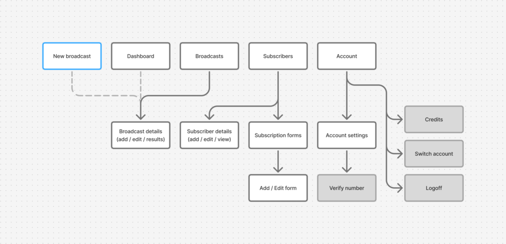
This led to a simplified architecture built around three core areas: dashboard, subscribers, and broadcasts. A persistent primary action and a centralized account area support the core interactions.

A centralized account area sits alongside the main navigation, allowing users to switch between accounts, check available messaging credits, access settings, and log out.
A system built for evolution
The product needed to evolve without breaking consistency. That required a system, not just screens. Early decisions had to support future features, new use cases, and increasing complexity without forcing redesigns or creating fragmentation across the interface.
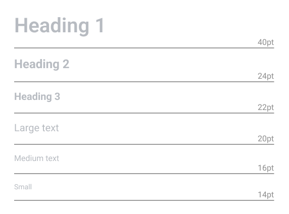
Components were designed to be flexible and reusable from the start. Form fields support different formats and use cases. Buttons clearly communicate hierarchy and state. Layout structures adapt without breaking consistency.
The system is guided by a simple principle: make the next step obvious.
Each page follows a consistent layout. A title bar defines context and allows inline editing when needed, especially in campaign flows. Primary actions are always highlighted, while secondary actions support without competing for attention.
This logic extends across the interface. In longer pages, actions are repeated at the bottom to maintain continuity without interrupting the flow.
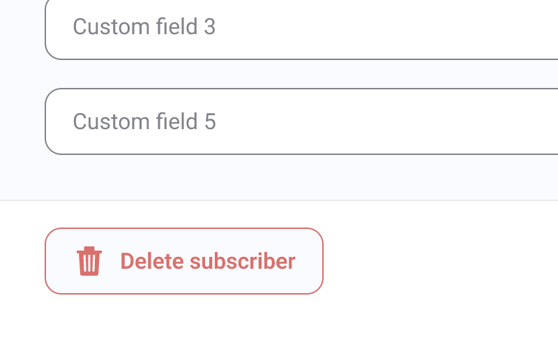
Destructive actions are separated and placed in predictable locations, avoiding interference with primary tasks.
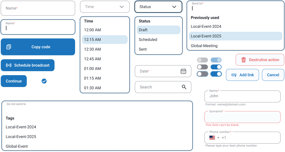
Composing a message
Campaign creation happens in a single, focused flow. Message, audience, and scheduling are handled side by side, with a live preview updating in real time. The interaction stays simple while still allowing control, and feedback during sending makes the system’s response visible and reassuring.
Building forms as flexible tools
The subscription form builder was designed to adapt to different data collection needs rather than enforce a fixed structure.
Fields can be added, removed, reordered, and customized, allowing users to define exactly what information they want to capture. All changes are reflected instantly in a live preview, while an embed code is generated in parallel for implementation. A simple tool that supports more complex use cases over time.
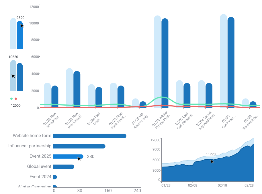
A lightweight dashboard
Given the nature of SMS, the dashboard focuses on a small set of meaningful metrics: messages sent, subscribers, and opt-ins. The main chart adapts to the volume of recent campaigns, expanding when needed, while a familiar table structure provides detailed views below. The goal was not to add more data, but to surface what is useful.
Results
- The platform launched and quickly onboarded its first clients, validating the core product in real use
- New features were introduced over time, including messaging automation, subscriber import and export, and expanded account settings
- The initial system supported this evolution without losing consistency, allowing the product to grow and adapt as new needs emerged