Skip to content
Bruno Pedrozo
About
Cases
Contact
Quintal Apsen
Shaping a new standard for webinars in the pharma sector
SendQ
Designing a scalable SMS campaign platform from the ground up
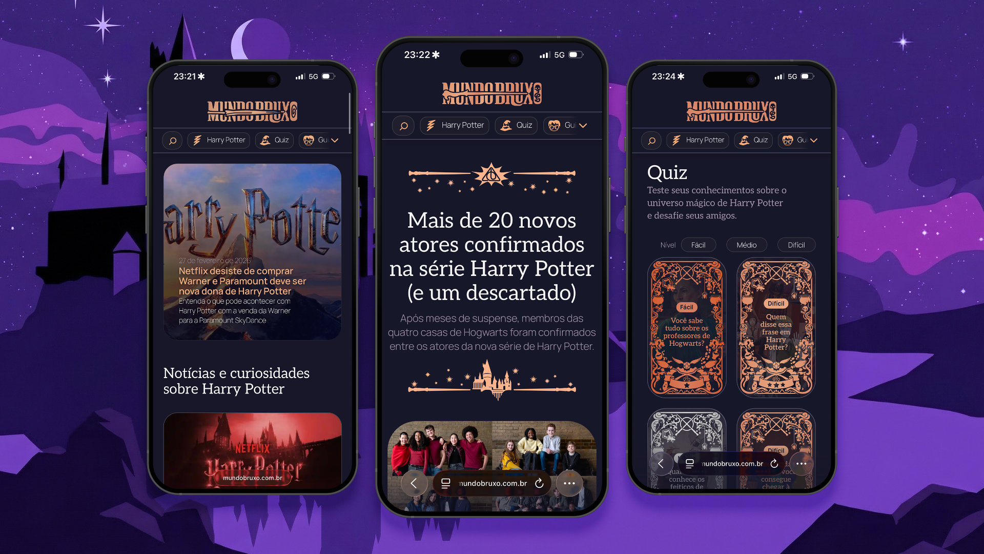
Mundo Bruxo
Redesigning the experience to encourage discovery without losing the magic
SendQ
Creating the design system that enabled a professional and scalable SMS platform from day one
Who Cares
THis is a second post in order to test everything
Bizarre Project
Enhancing the Digital Experience to Support Growth, Retention and Everyday User Tasks Across a Scalable Platform
Hello world!