Mundo Bruxo is a Brazilian portal dedicated to the Harry Potter universe. Over the years, the site accumulated a large library of editorial content and began receiving most of its traffic through search engines and Google News.
This created a clear behavioral pattern: most readers landed directly on a specific article and rarely explored other areas of the site. In 2025, sessions consistently averaged 1.2 pages per visit throughout the year. At the same time, the average session duration exceeded one minute, suggesting that readers were engaged with the article they came for but rarely moved beyond it.
Key challenges
#1
The site was experienced as isolated pages
Most visitors arrived through Google and rarely navigated beyond the article they came for.
#2
Too many competing elements for attention
Intrusive elements, including pop-up and auto-inserted ads, disrupted the reading experience.
#3
The visual identity no longer reflected the quality of the content
Intrusive elements, including pop-up and auto-inserted ads, disrupted the reading experience.
The redesign set out to modernize the visual identity and improve navigation depth, while preserving and strengthening the sense of wonder fans expect.
Reimagining the brand
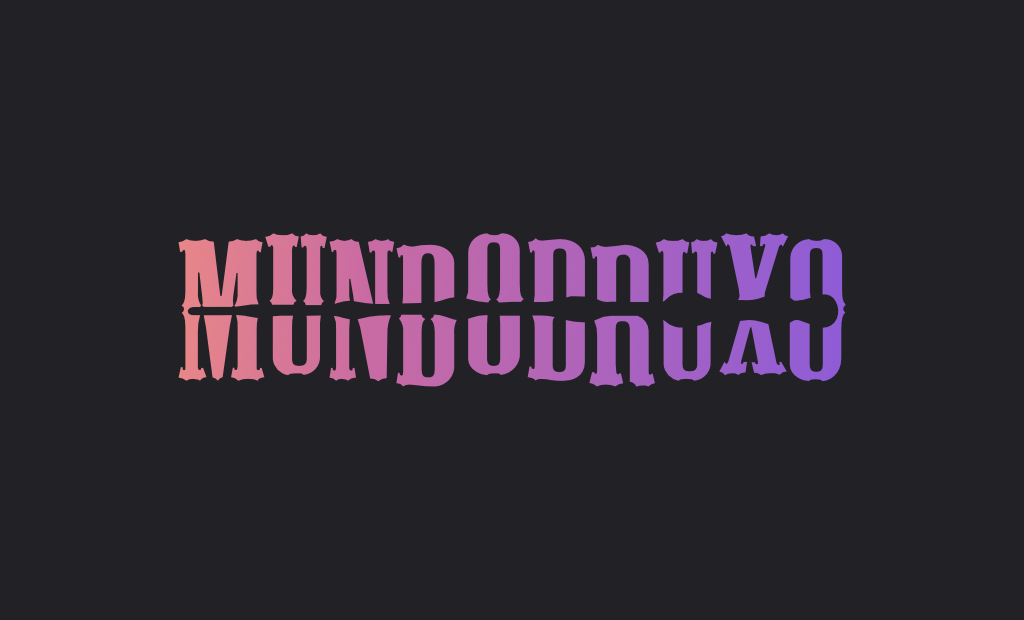
An unexpected issue with the previous identity was legibility. The way the wand split the name often made users read the title as Mundodruxo. The redesign reorganized the typographic composition and simplified the serifs to improve legibility, especially on mobile, while preserving the magical character of the type.
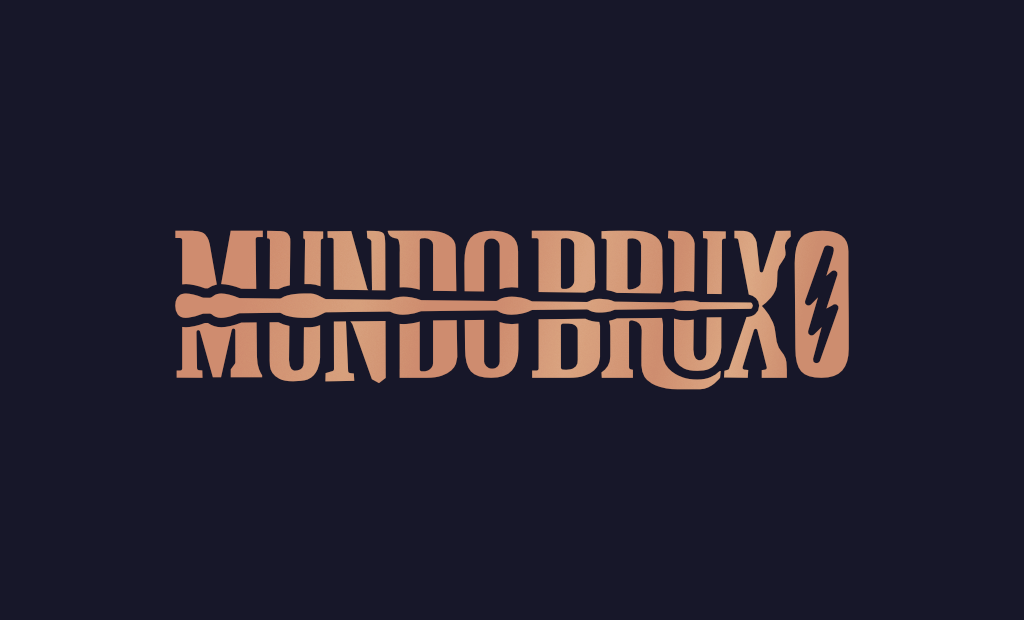
The central wand was filled and now points to the right, casting a spell into the letter O, marked by Harry Potter’s iconic lightning bolt. The logo also adopts a golden tone, reinforcing its connection to the Harry Potter universe.
The logo appears in multiple variations across pages and loading states, referencing different characters through their wands and signature spells:
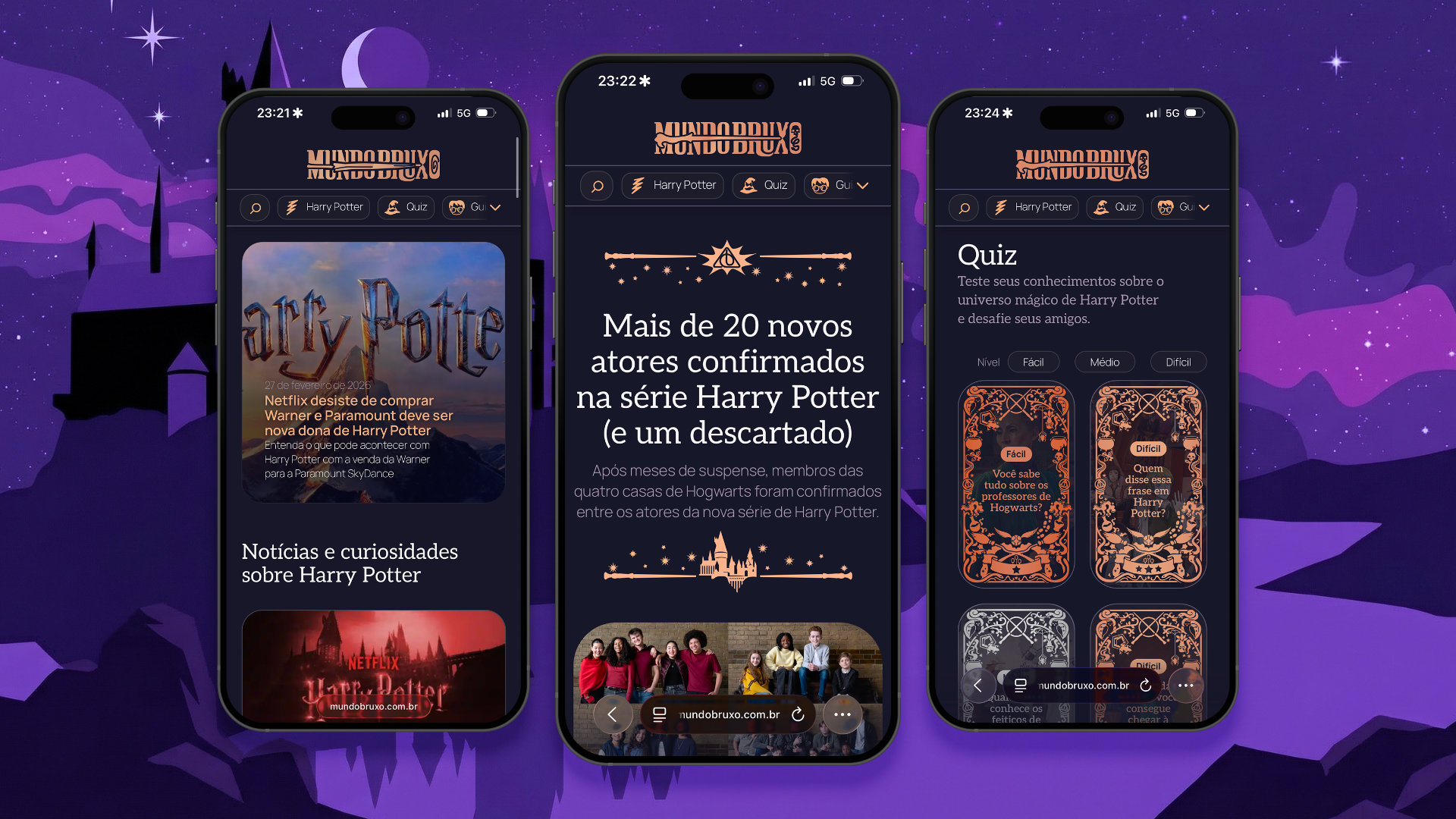
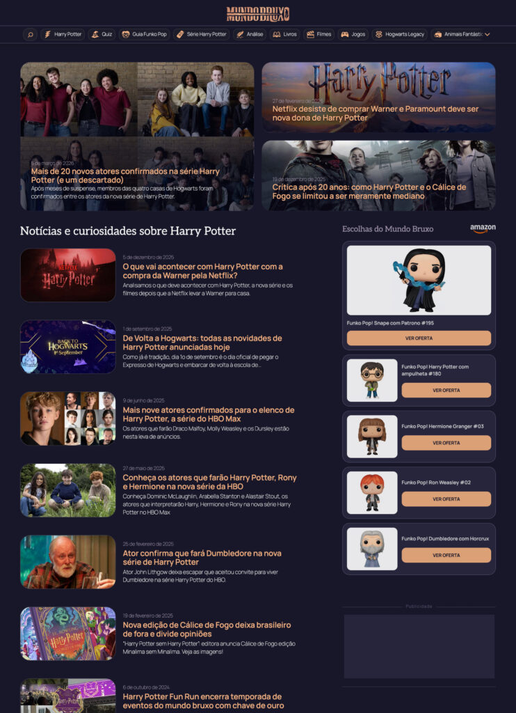
Content as the center of the experience
The redesign of the editorial page started with a simple premise: less distraction, better reading. The layout was simplified by removing sidebars and reducing intrusive elements, including auto-inserted ads that often interrupted the reading experience. Typography, contrast, and spacing were refined to improve readability during longer reading sessions.
Elements appearing at the right moment
Floating buttons for sharing, commenting, and liking, inspired by modern social networks, appear once readers are already immersed in the article, encouraging engagement without interrupting reading.
Designing for deeper exploration
The navigation was redesigned to encourage exploration across sections, making the site’s structure more visible while keeping fixed elements minimal and non-intrusive.
A fixed header introduces the main sections through horizontal navigation alongside search. The logo collapses during reading and reappears on scroll up, and the menu can expand into a full list view, keeping key categories like “Harry Potter” always visible.
Respecting the reading experience
Monetization was preserved but made less intrusive, with clearer ad labeling and fewer disruptive formats to maintain a more respectful reading flow.
Magic lives in the details
Beyond structural improvements, the redesign also aimed to reinforce the magical tone of the experience. These details are intentionally understated, but they help establish the atmosphere of the site.
Illustrations and subtle microinteractions were introduced throughout the interface, such as the animated shine that appears on the logo during page load and mouse over.
Quizzes received a more expressive visual treatment, with illustrated frames and interactive animations. The main card subtly reacts to cursor or touch movement, creating a sense of depth and responsiveness.
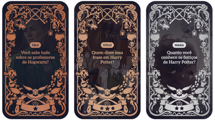
The frames also communicate difficulty levels using medal-inspired colors: bronze, silver, and gold.
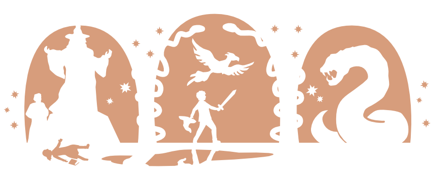
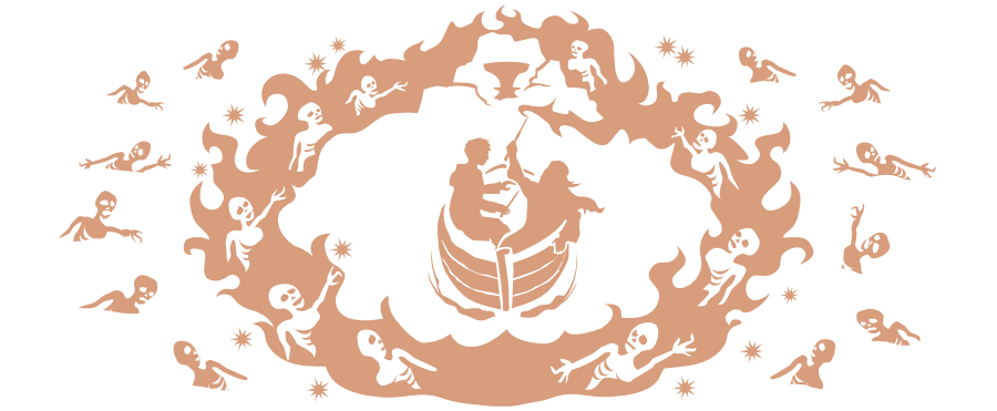
Illustrations inspired by the books
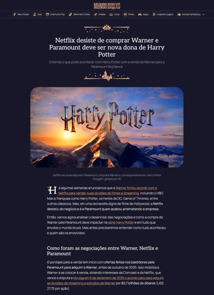
Each page ends with an original illustration depicting a memorable moment from the saga. These scenes were created based on descriptions from the books, rather than the film adaptations, resulting in visual interpretations that sometimes differ from the cinematic imagery.


Results
The new design was launched recently, and early signals already show a clear shift in engagement patterns: users are exploring more content and spending more time within each page.
- navigation depth increased by 47%
- scroll depth grew by 30.8%
- active time increased by 75%
Dead clicks dropped by 72%, reflecting clearer interaction cues and fewer dead ends, while quick returns increased by 480%, suggesting a more dynamic navigation behavior, with users moving more frequently between pages.
Beyond the numbers, qualitative feedback highlights a cleaner visual identity, fewer distractions, and clearer paths across the experience.